A/B test analytics
To view A/B test analytics, go to the Analytics dashboard or click View Results directly from your A/B test. You can view your A/B test analytics at any time during or after the test. (Note that it may take 2-4 hours to see results in Analytics.) For a general refresher, see Analytics basics.
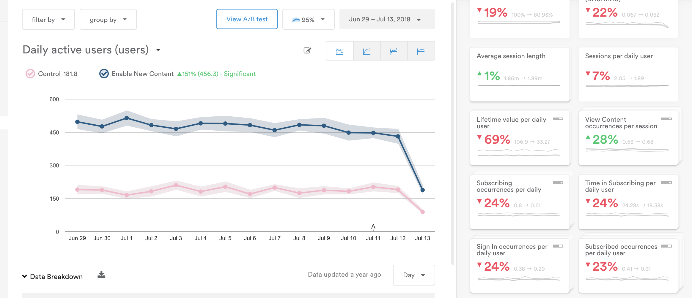
The Analytics dashboard has two main sections: the graph (left) and the metric tiles (right).

The Analytics display is responsive to your screen, so if your screen is smaller than 1600px the metric tiles will appear beneath the graph.
Graph
By default, the graph will show the top Goal metric you gave your A/B test. If you didn't set a goal, the graph will show Daily Active Users by default.
To change the graph display, select a metric from the metric selector dropdown or the metric tiles.

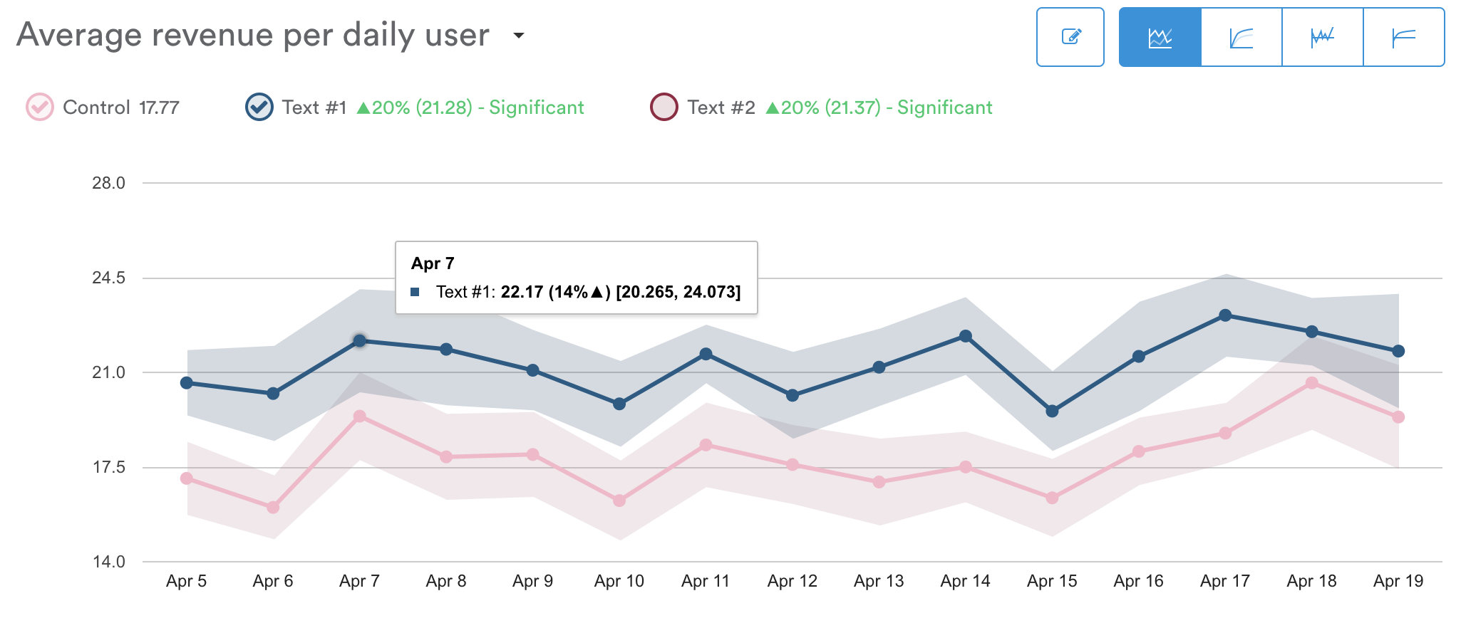
"Average revenue per daily user" is the current selected metric from the dropdown.
Variants and control (test groups). Above the graph, you'll find labels for the control and variant groups, as well as the percent change each variant experienced compared to the control. Checking the circle next to each variant adds it to the chart for comparison.
Data points. Hover over a data point along the line graph to see the date, variant name, average value for that day, difference compared to the control group, and the upper and lower bounds of the confidence interval (shaded region). See below for an example from the report "Average session length (minutes)."

On May 13th, the average session length for users in the overrides group was approximately 1.86 minutes, which is 14% higher than the control group. We can assume with 95% percent confidence that the true value for average session length would be somewhere between 1.837 and 1.886 minutes.
Confidence interval. The shaded regions around the line graphs represent the high and low bounds of your confidence interval. The confidence interval defaults to 95%, meaning based on the data provided, we estimate with 95 percent probability that the true data point will fall somewhere within the shaded region.
If the shaded regions for the two test groups do not overlap, then you likely have a statistically significant difference between those two groups. This means you can roll out the new feature or campaign to a larger audience more confidently based on your test results.
Change your confidence intervalYou can change the settings for your confidence interval by selecting the percentage dropdown above the graph (near the date range of the graph in the upper right corner). A higher confidence interval will likely create a wider range of possible values.
Statistically significant changes between variant groups are also shown in green or red text next to the variant names above the graph.
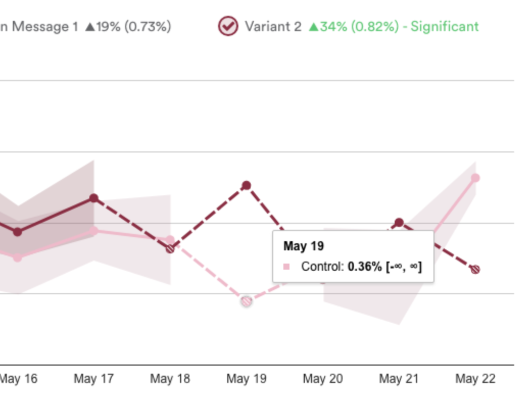
Solid vs. dashed line. If you see a dashed line instead of a solid line with data points, it means there is not enough data to reach significant results.

Infinity symbol. If you see an infinity symbol in place of the outer bounds of the shaded region, it means there was not enough data to calculate significance (the shaded region).
Metric tiles
The metric tiles surface important data so you can see the impact of your campaigns at a glance. They show changes in metrics compared to the control group.
Click a metric tile to see that metric represented in the graph, see a breakdown of data, and download the report.

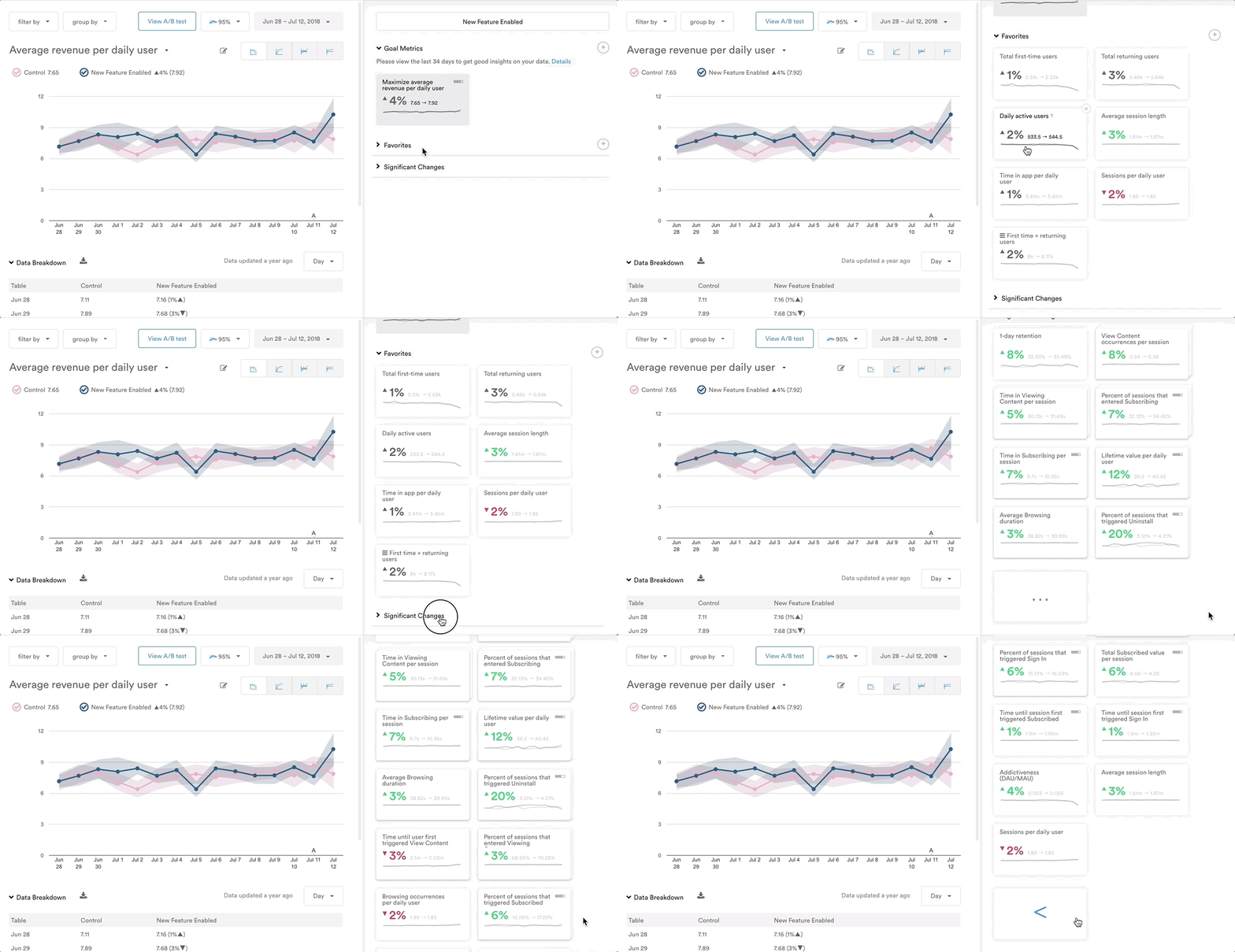
The metric tiles are organized into four categories:
- Goals
- Favorites
- Significant Changes
- Messaging (when relevant)
Color coding. A green or a red metric tile indicates that the metric has experienced statistically significant change based on this test. Green indicates a positive change in the metric, while red indicates a negative change.
Signal strength indicators. The signal strength of a metric represents the portion of your audience that a metric reaches. Signal strength appears as a small grey bar in the upper right corner of a metric tile. (Signal strength only appears on tiles relating to custom events, not on standard out-of-the-box metrics.)

For example, metrics that reach a large portion of your audience, such as the percent of users per day that trigger "main menu," would have a strong signal strength. Other metrics might have a weaker signal strength if fewer users access that portion of the app, such as the percent of users per day that trigger "language settings."
Signal strength is designed to put metrics into perspective. For example, even if a metric has a very drastic change in terms of statistical significance, you may decide that it's not as important as other metrics if it only affects a very small portion of your audience.
Goals
For any A/B Test or Holdback Message, you can select as many goals as you need. Since all data will be captured and analyzed for this test by default, goals can be added or removed from the test at any time, without any loss of historical data.
Favorites
Just like every report in Leanplum, your favorite metrics will be shown for quick analysis. Favorites can be changed and updated at any time, from any report. Use this section to save your most important metrics which can be used to analyze the results of any test or campaign.
Significant Changes
Significant Changes is a section that Leanplum automatically populates with any metric that undergoes a statistically significant change as a result of this test. The tiles are ordered it in terms of magnitude of that change. We do this to help you avoid unforeseen consequences when running a test. For example, a test may positively affect your goal metrics, but negatively affect other metrics you didn't expect. This way, you can make the most informed decision about which test variant is best for your app and your users.

A/B test event metrics. Leanplum automatically tracks both test impression and test holdback events. You can view metrics for these A/B test events by using the metric selector dropdown above the graph. Select your A/B test event from the dropdown to see all metrics for that event (you can also search for the event using the dropdown). For more info on these events, see Event metrics.
Messaging
This section will only be visible if you A/B tested a message or campaign.
If you are running a test that includes a message, you will automatically see the default messaging metrics in the A/B test analytics. These metrics show statistical significance as well, making it quick and easy to tell if one message variant is encouraging more engagement than another.

Return to test
Once you are satisfied with your test results, you can finish your test and roll out the winning variant. From the A/B Test Analytics page, click View A/B test to navigate back to your test’s setup page. Or you can click the A/B Tests tab in the sidebar and choose your test.
Updated 7 months ago
