
Images in messages
Our SDK does a lot of work behind the scenes to fit your images into our message templates. Depending on the type of message you are sending, your image may be letterboxed or cropped to fit.
For example, images with a set width and height will letterbox to ensure they fit in the message. Full-screen messages, however, may crop images fit different device sizes. To prevent letterboxing or cropping, take a look at image size recommendations below.
Test on a real device 📲Even if you follow our image size recommendations, make sure you test all messages on a real device to ensure that everything looks exactly how you want it to.
| Message type | Image size recommendations | Example image |
|---|---|---|
| Push Notifications | Push images: iOS 12 requires an aspect ratio of 1:1 or 3:2. Other sizes of images will be trimmed to fit these guidelines. File size may not exceed 1MB. | 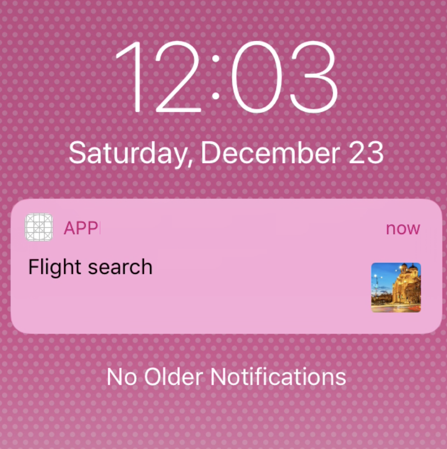 |
| Center Popup | Background Image: Images that don't match the width:height of your message will shrink or stretch to fit. | 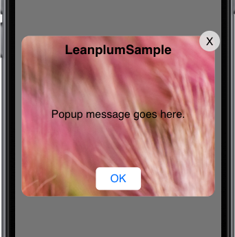 |
| Push Pre-Permission | Background Image: Images that don't match the width:height of your message will shrink or stretch to fit. | 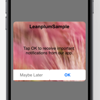
|
| Interstitial | Full-screen background image: Images may be cropped to fit the user's screen, depending on how the image size compares to the user's device. We recommend localizing your message to different devices to prevent cropping. | 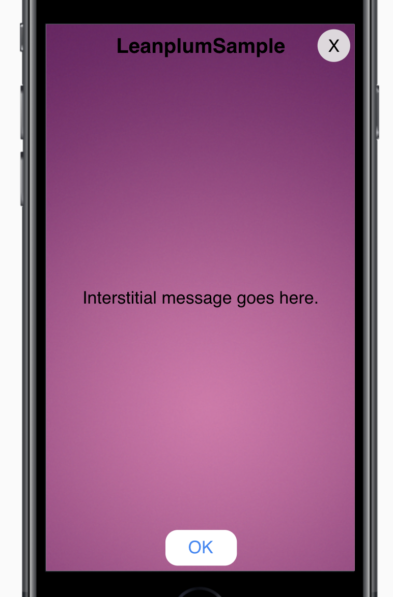 |
| Star rating | Hero Image option: Height is fixed at 140px and the width is 100% of the message width (defaults to 340px). So, for best results, use an image with an aspect ratio of 340:140.
Matches the width:height the of message (including the button). Default width:height is 340:230px. Images that don't fit the aspect ratio of the message will shrink to fit, which may create blank spaces/ edges. | Hero image:\ 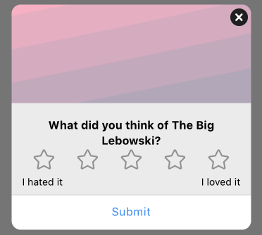 Background image:\ 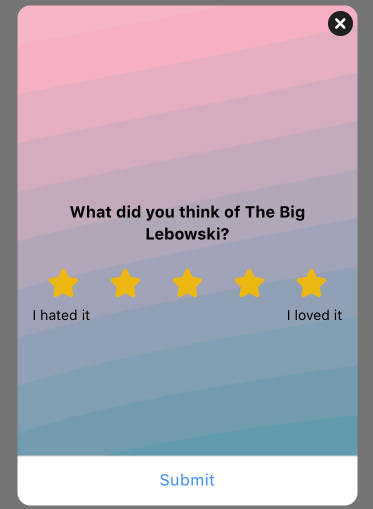 |
| Rich interstitial | Hero Image option: Height is fixed at 140px and the width is 100% of the message width (defaults to 340px). So, for best results, use an image with an aspect ratio of 340:140.
Matches the width:height the of message (including the button). Default width:height is 340:230px. Images that don't fit the aspect ratio of the message will shrink to fit, which may create blank spaces/ edges. | Hero image:\ 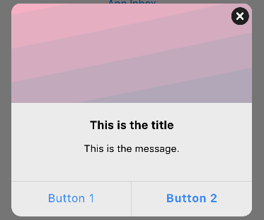 Background image:\ 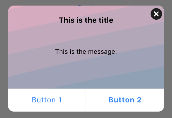 |
| Banner (rich) | Hero image option (appears on side of banner text): The width of the hero image is fixed at 100px and the height is set to 100% of the message height (defaults to 60px). So, for best results, use an image with an aspect ratio of 100:60. Remember, changing the message height will change the hero image's aspect ratio. Increasing to 70px, for example, would change the required ratio to 100:70. Background image option: To account for different device sizes, the background image will be letterboxed on some devices or in landscape orientation. For consistent results, set the message width equal to the image width. This will ensure the full image is always displayed (on devices wide enough to display it). | Hero image:\ 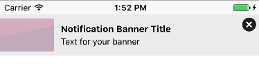 Background image:\ 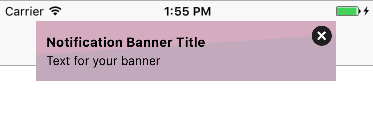 |
Updated 10 months ago