
Center popup
The center popup is a larger one-button message with more flexibility in design and length than the alert message. It can include a background image, colored text, and supports different message (Layout) sizes.
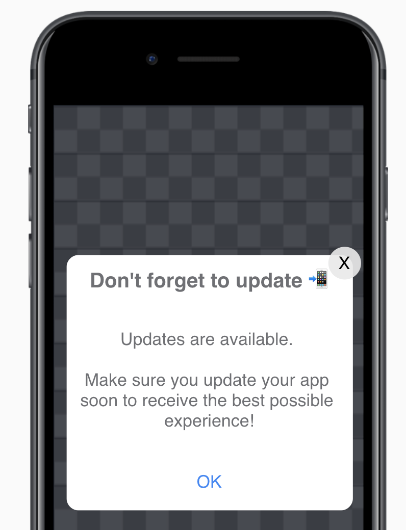
To send a center popup message, choose In-app message as your action type, then select the Center popup template. Next, you'll move to an editor where you can edit the content of your message.
Edit
Use the settings in the Edit window to customize the content of your message.
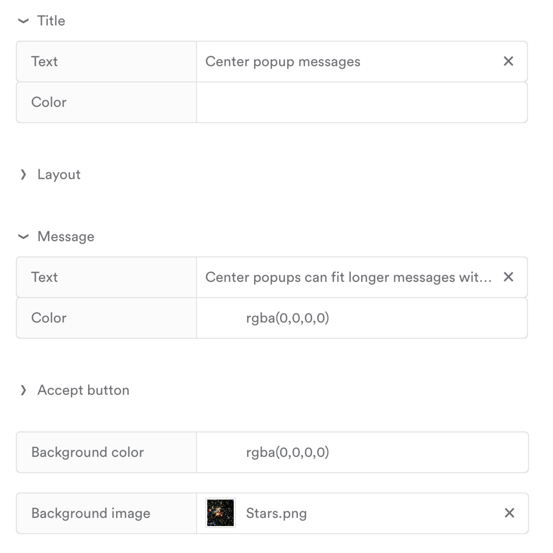
| Title | |
| Text | Your message's title. |
| Color | The color of the title text. You can input the rbga values, a hex color code, or use the color picker. |
| Layout | Allows you to adjust the size of the message. |
| Width | The width of the message. Accepts sizes in px. |
| Height | The height of the message. Accepts sizes in px.
|
| Message | |
| Text | Your message's written content, which can include emojis! 😎 To add other custom values like attributes and events, see Personalize a message {{. |
| Color | The color of your message content. You can input the rbga values, a hex color code, or use the color picker. |
| Accept button | |
| Text | The text that will show on the button. |
| Background color (Button) | The color of the button. You can input the rbga values, a hex color code, or use the color picker. |
| Background color | The color of the message's background. You can input the rbga values, a hex color code, or use the color picker. |
| Background image | An image that spans the background of the message.
|
Updated 10 months ago
Did this page help you?